03 Dec

Our Rebrand Journey
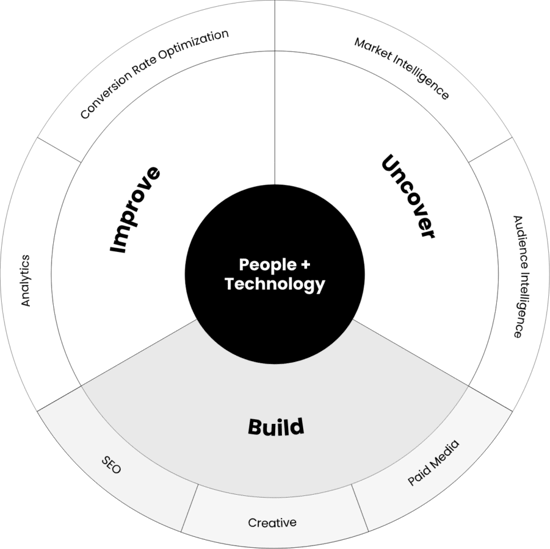
In 2021, if you asked 10 people at Seer Interactive what our vision is, how our service lines work together, or what our proprietary technology does … you’d most likely get 10 different answers.
Most of the time, all those answers were accurate, just explained at different depths, with different words, and through different viewpoints.
One thing was clear though — when it came to consistently and concisely highlighting the high level value of Seer to a potential client or team member, we were falling short.
Hypothesis & Goals
If we can re-define and re-align our brand across all facets of our business — we’ll generate a better-fit audience of clients, team members, and partners to help us grow.
And when Seer grows, so does the impact on our communities (i.e. our Clients, Coworkers, Industry, and the actual communities in which we live and work).
To achieve this, we set the following goals for the Rebrand:
- Elevate Seer’s Brand Perception: Our branding needs to represent the quality work our team completes each day for our communities.
- Simplify Our Value & Services Positioning: Our brand story, services and technology value-adds, our differentiators in the marketplace. Create definitions that are easy to understand and enable people to quickly decide if we sound like the type of agency they want to work with/for (or not!)
- Scale Content Management & Automation: With the Redesign, we took it as an opportunity to also get more efficient with our marketing technology stack by migrating our CMS from WordPress to HubSpot. This will enable us to connect our website, content, and campaigns for greater automation capabilities and test new ways of engaging with our audience at each step of their journey with Seer.
The Process
Working with BLVR, our branding agency – we compiled internal team and client perceptions, desires, challenges, and goals as well as analyzed the competitive landscape, current market trends, etc.
We brought it all together to find the opportunity for us to target our audience segments in a way that would resonate – leveraging our unique value proposition (UVP) alongside what we learned through:
- Questionnaires
- Stakeholder interviews
- Net Promoter Score study
- Existing sales, marketing, and culture collateral
- Competitive audit
- Industry research
This enabled us to create a strategic framework for the Seer Interactive rebrand that all pointed back to two things:
- Staying true to our core values
- Addressing our audience’s needs
Our branding agency used the above to put together the new creative concept you'll find across our website and marketing materials.
Re-Introducing Seer
New Culture Code & Positioning
Our mission at Seer Interactive is to harness compassion, data, and technology to make a mark on our communities.
Belief
Relentlessly pursuing (and sharing) the truth.
Purpose
To unlock potential.
Vision
A world where it’s easy to do the right thing.
Positioning
You know your business; we know the data. Let’s bring it all together.
New Style, Logos & Colors
Our goal was not to change who Seer is – we are still the same heart, soul, and brains that built this company.
Rather, we set out to better visualize who we already are. And we are BRIGHT! Just take a look at our new style:
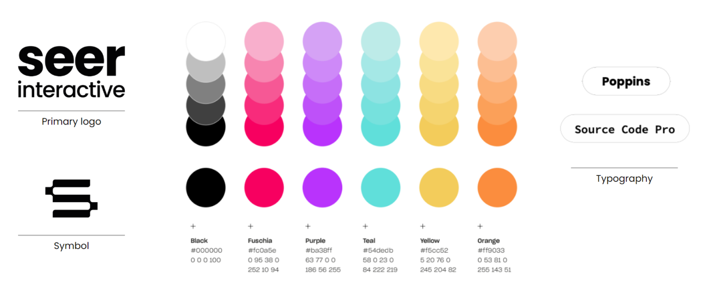
While we’ve tightened up our look and feel, we also felt it was important to maintain a calling to our roots.
Here are two ways we’ve attempted to create that connectivity:
The “S” Symbol
We wanted to find a way to bring our brand into the future while paying homage to our old school roots – the “S” symbol represents that and the rounded-edge points emphasize the process of innovation coming together.

The “Spray Paint” Effect
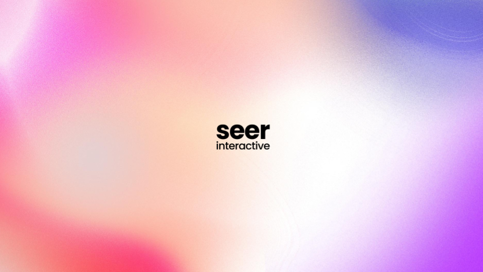
We are a digital marketing agency that works to holistically understand the digital experience for our client’s users.
The spray paint effect used throughout our new branding is a memento of that integration and the new innovations (colors) that can emerge from it.
What’s Next
Our new website has launched (!) and with it, a whole new set of challenges for us to tackle and refine going forward. Our goal is to ensure the best possible user experience during this time of transition and migration - let us know if that's not the case for you!
Over the next few months, we’re going to be doing our best to fix anything that was broken and appreciate your patience in advance. We’ll be sure to share more on our journey to help others with their own Rebrand / Redesign in the near future.
Thank you so much for being part of Seer’s journey these past two decades. We are honored by your trust and support along the way. And special shout out to all those who helped us evolve to where we are today – it truly took a village!
Source: www.seerinteractive.com, originally published on 2022-12-01 23:00:00

![How to Successfully Use Social Media: A Small Business Guide for Beginners [Infographic]](https://b2webstudios.com/storage/2023/02/How-to-Successfully-Use-Social-Media-A-Small-Business-Guide-85x70.jpg)


![How to Successfully Use Social Media: A Small Business Guide for Beginners [Infographic]](https://b2webstudios.com/storage/2023/02/How-to-Successfully-Use-Social-Media-A-Small-Business-Guide-300x169.jpg)


Recent Comments